Category: type design

  • Makeda typeface

    Makeda typeface

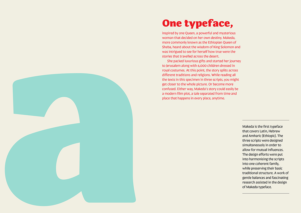
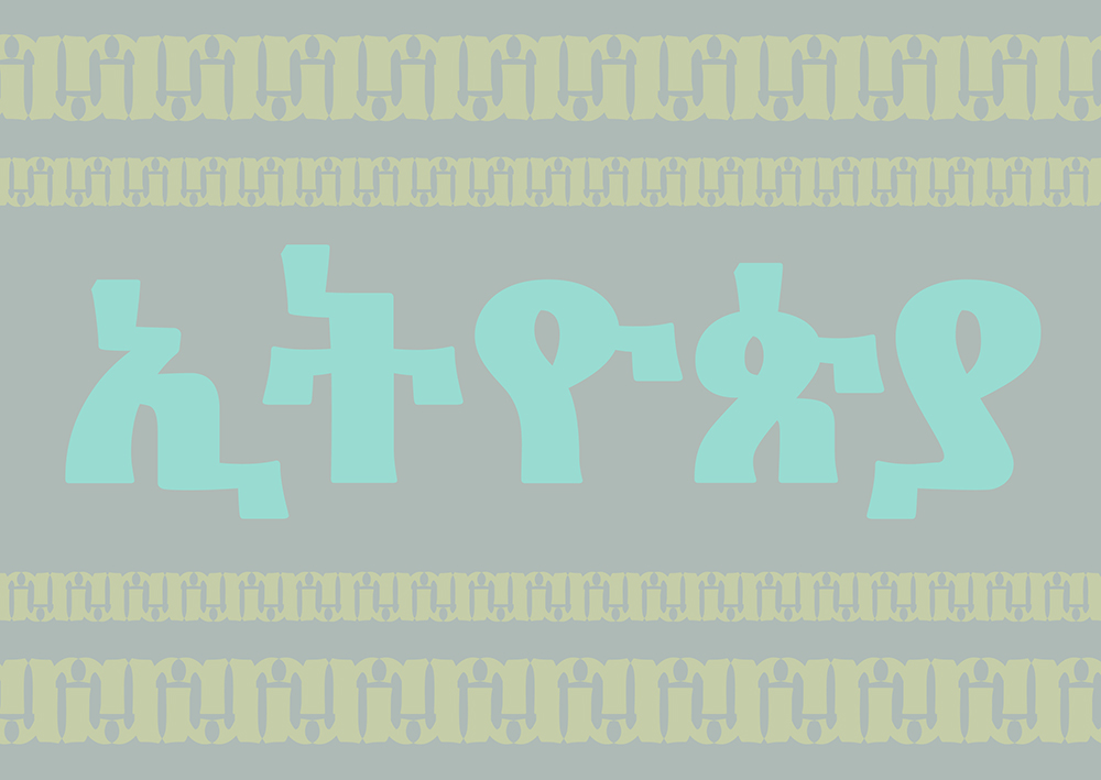
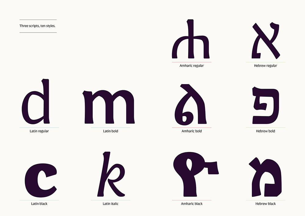
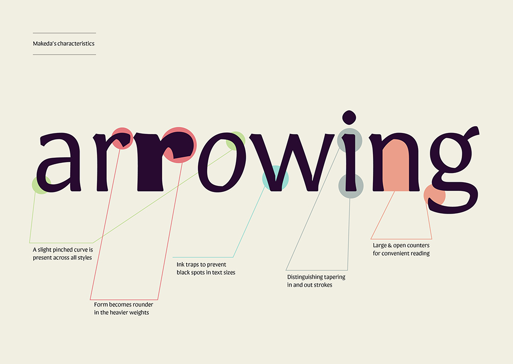
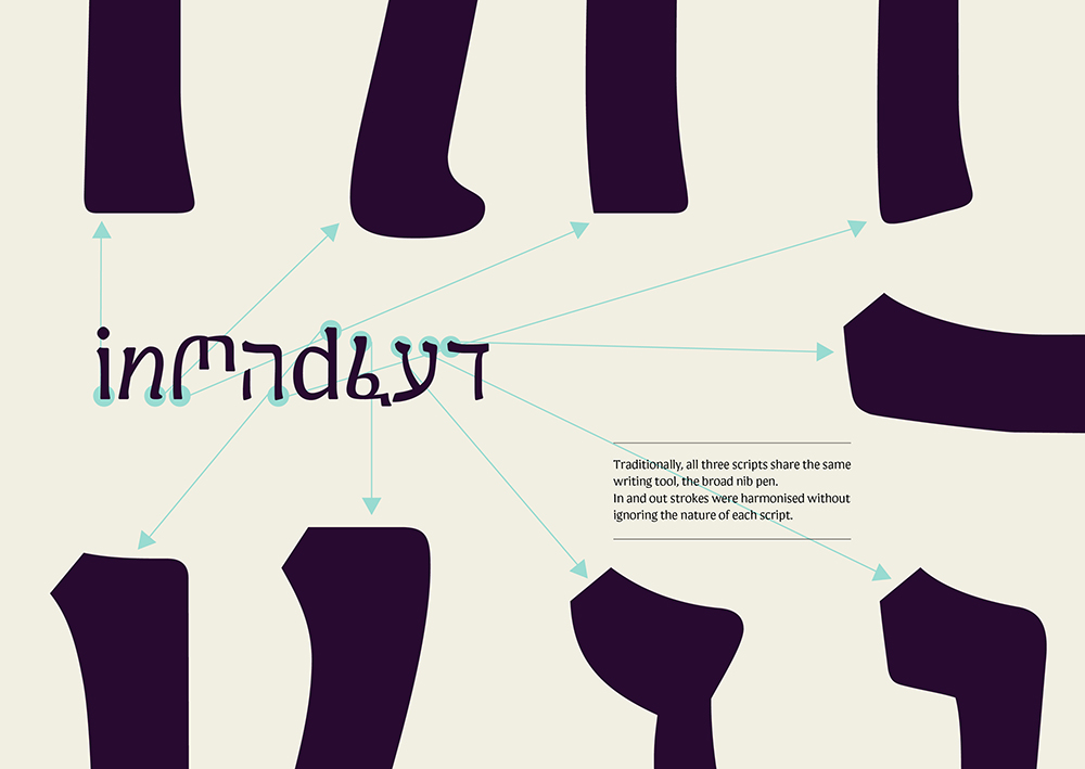
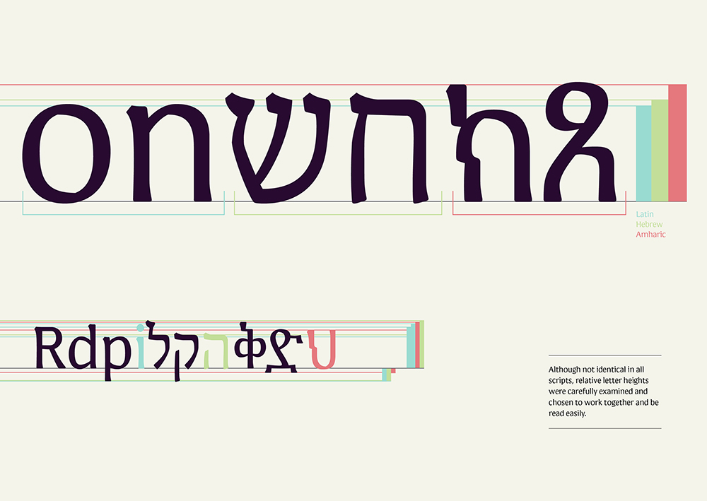
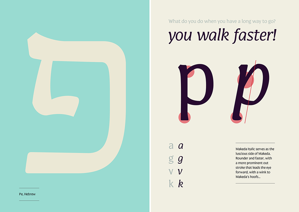
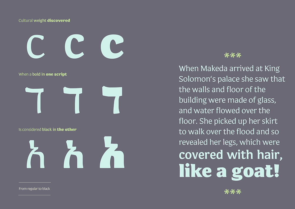
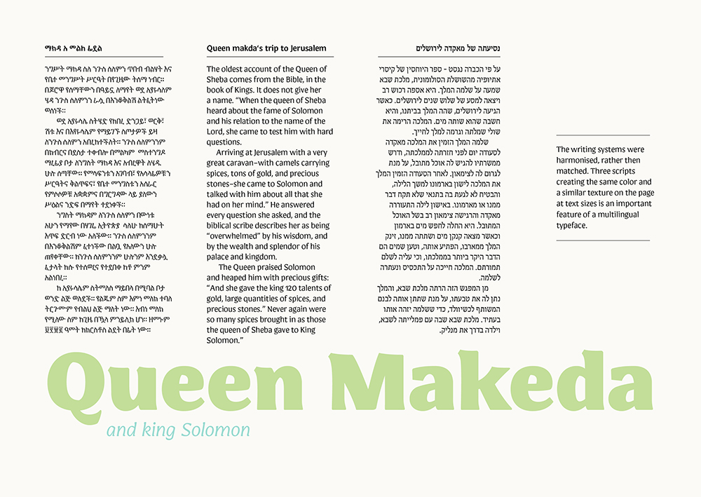
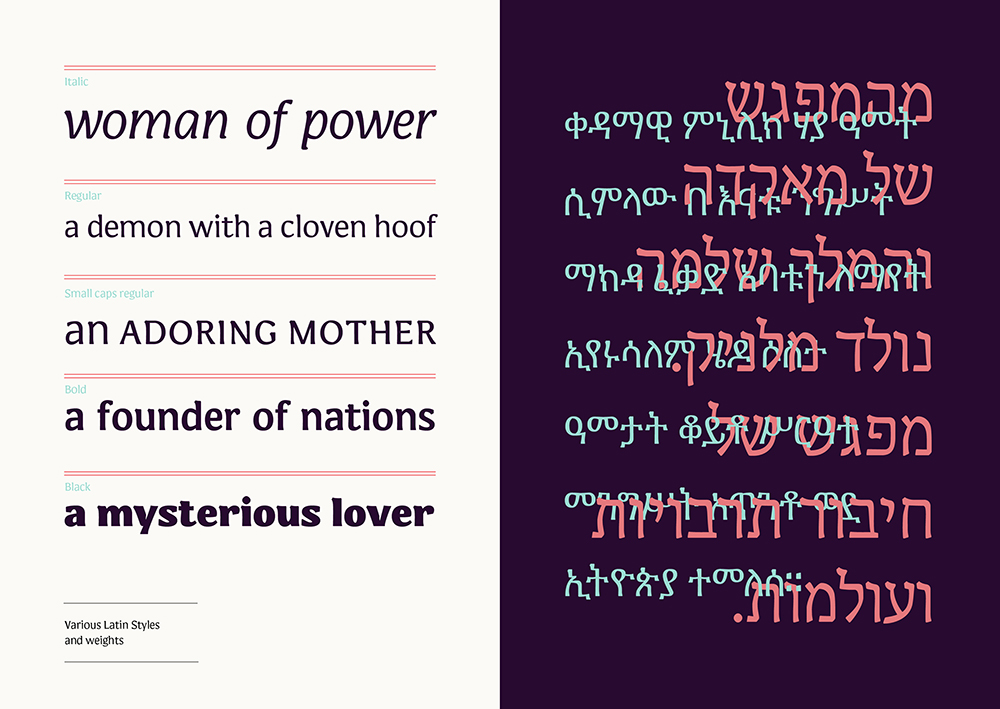
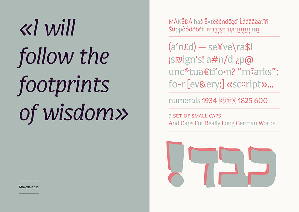
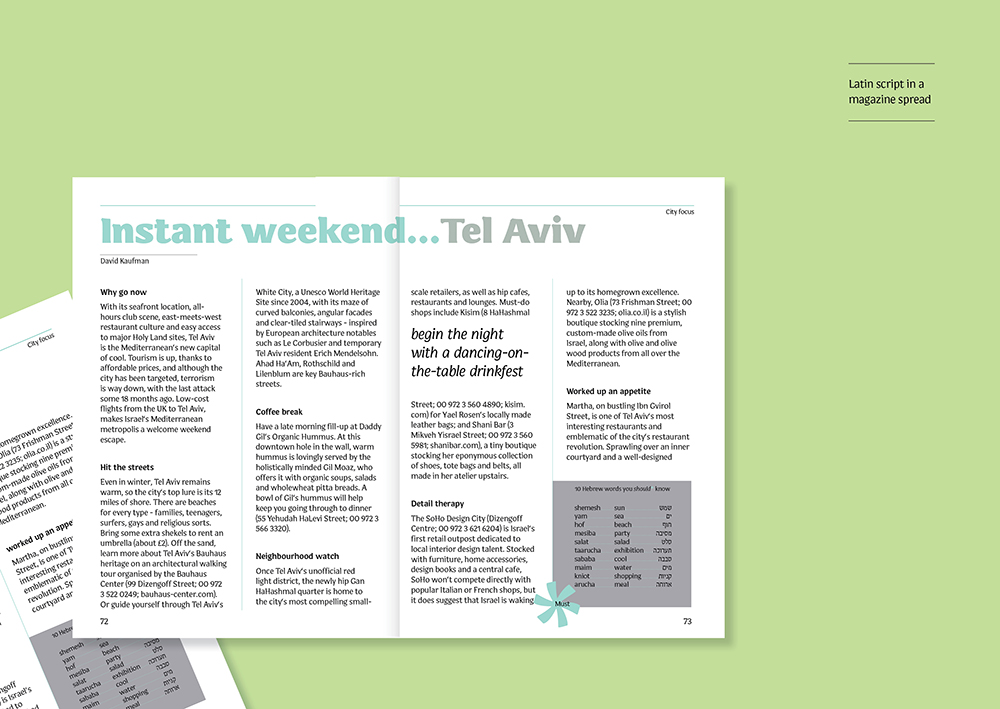
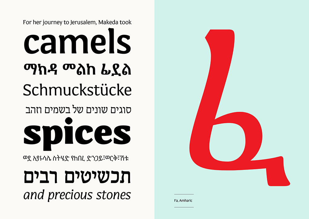
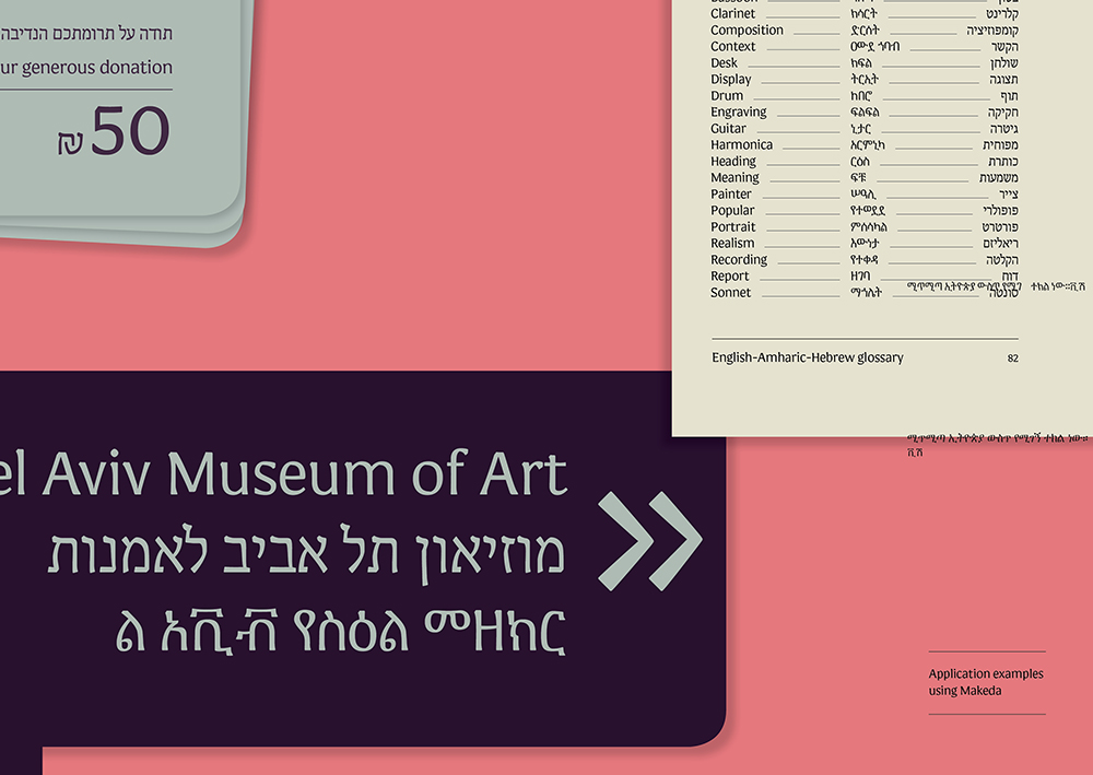
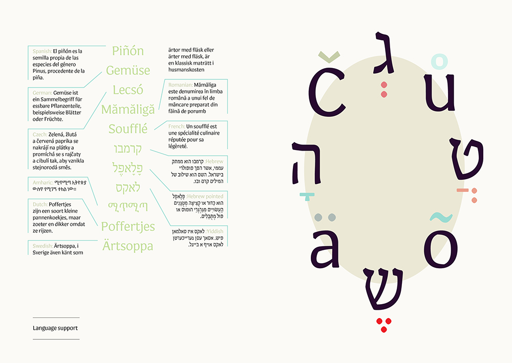
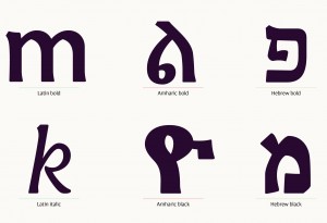
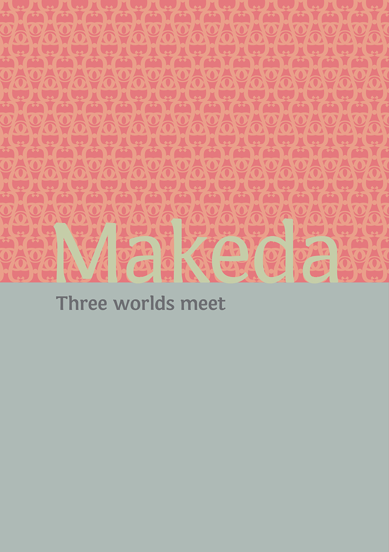
    Makeda, is a typeface designed in three scripts which bring together different worlds. Hebrew, Amharic (Ethiopic) and Latin are harmonised with each other, while maintaining loyalty to the unique structure of each script. The story of Makeda, the Ethiopian Queen (also known as the Queen of Sheba) is a story of a powerful and mysterious woman, traveling to meet King Solomon in a history changing act. The typeface is intended for multi script use, suitable as a text typeface with generous x-height and large counters.

    The typeface is part of MA in Typeface Design studies at Reading University

    For more information about the design process, please click here

    מאקדה, הינו גופן המעוצב בשלוש שפות אשר מקרב בין עולמות שונים. עברית, אמהרית (אתיופית) ולטינית משולבות בהרמוניה זו עם זו ובמקביל שומרות על המבנה הייחודי שלהן. הסיפור של מאקדה, המלכה האתיופית (הידועה גם כמלכת שבא) הוא סיפור של אשה מסתורית וחזקה, אשה נסעה לפגוש את המלך שלמה בירושלים במעשה אשר שינה את פני ההיסטוריה. הגופן מיועד לשימושים רב לשוניים, ומתאים כגופן טקסט בעל גובה אות רחב וחללים פנימיים גדולים.

    הגופן עוצב במסגרת לימודים תואר שני באוניברסיטת רדינג, אנגליה

    לעוד מידע על תהליך העיצוב, אנא לחצו כאן
    makeda1makeda2makeda4makeda3makeda7makeda6makeda5makeda10makeda9makeda8makeda11makeda13makeda12makeda14makeda15makeda16

  • Business as Usual

    Business as Usual

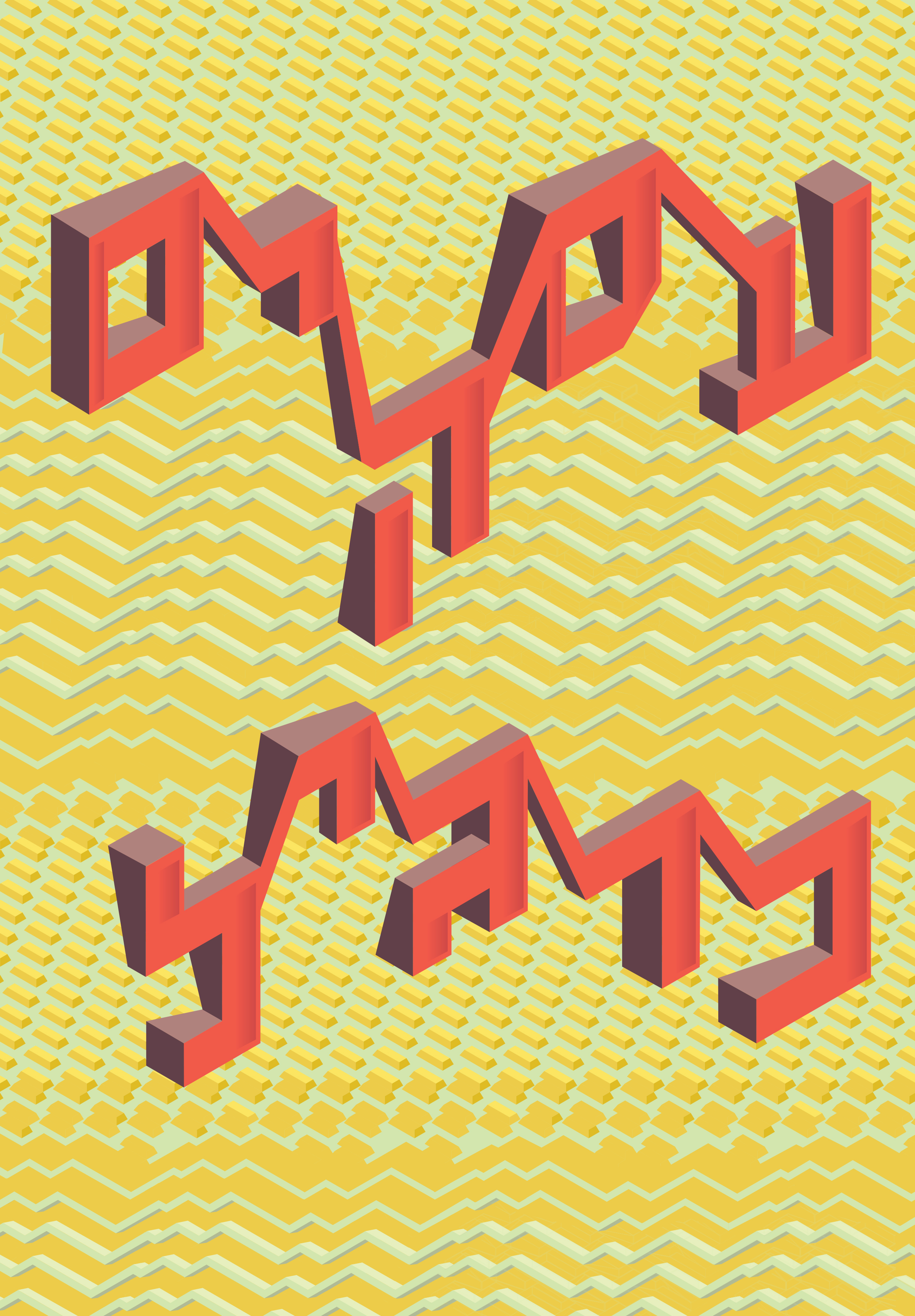
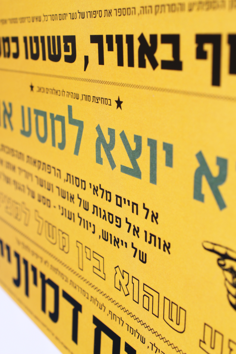
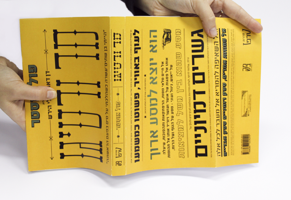
    A poster designed as part of “30 years for the business newspaper Globes” exhibition. The poster deals with the instability and changes in the business world. The design and the typography contradict – or complete one another (the Hebrew writing means “business as usual”). The background in not noticed at first glance: gold bars that become graphs and vice versa, emphasise the development and movement of the financial world.
    הכרזה עוצבה עבור תערוכת “גלובס: 30 שנות עסקים”. הכרזה מתארת את חוסר היציבות והשינויים בעולם העסקים. הכיתוב והעיצוב הטיפוגרפי מנוגדים זה לזה, או משלימים זה את זה. את הרקע ניתן להבין במבט שני על הכרזה – מטילי זהב אשר הופכים לגרפים וחוזר חלילה – מדגישים את ההתפתחות והתנודות אשר עוברים על עולם העסקים והפיננסים.
    Business_as_Usual
  • ARAVRIT

    ARAVRIT

    Aravrit is an experimental writing system presenting a set of hybrid letters merging Hebrew and Arabic.
    Each new letter is composed of the top half of an Arabic letter a the bottom half of a Hebrew letter so in In order to read it- any Hebrew reader would look at the bottom half of the letters, and an Arabic reader would look at the top half. The identifying features of each letter were retained, however, in both languages, the fusion required some compromises. It was crucial to maintain readability and have a minimal detriment to the original script.
    Through stitching together two scripts, Aravrit sends a message of life together: one can read the language he/she chooses, without ignoring the other one, which is always present.

    For Aravrit project’s Facebook page click here

    ערברית הינו פרויקט אוטופי המציג מערכת אותיות היברידית מקומית אשר משלבת בין עברית וערבית. בכתב זה המורכב בחציו העליון מערבית ובחציו התחתון מעברית נשמרו המאפיינים המזוהים של כל אות, אך עם זאת, בכל אחת מהשפות בוצעו פשרות באופן הקריאה הרגיל.

    בערברית, כל אחד יכול לקרוא את השפה שהוא בוחר, אך מבלי להתעלם מהשפה השניה, שתמיד נוכחת.

    לעמוד הפייסבוק של ערברית לחצו כאן
    jaffa water


    © 2012 Liron Turkenich ALL RIGHTS RESERVED


  • DETECTIVE BOOK COVERS

    DETECTIVE BOOK COVERS

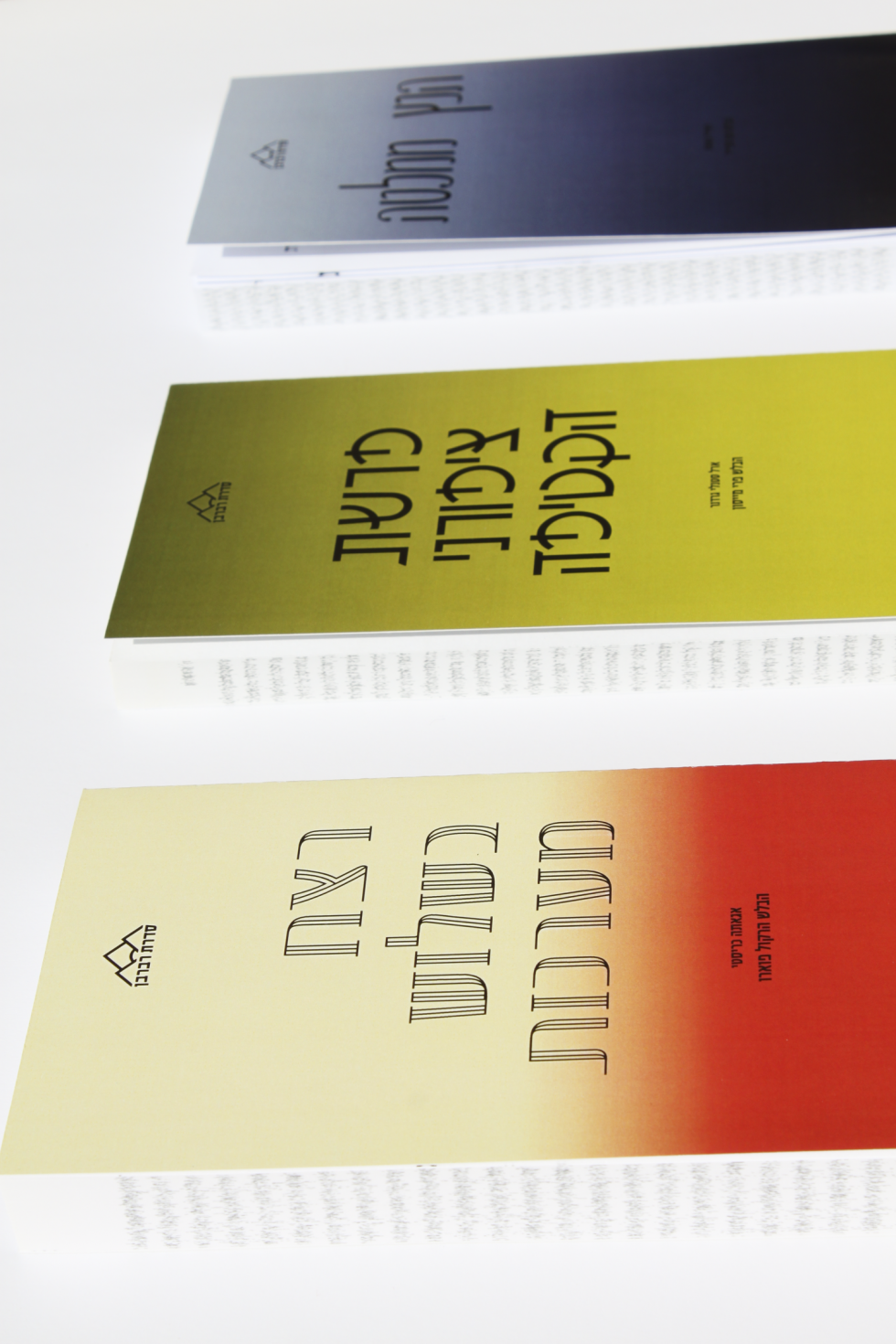
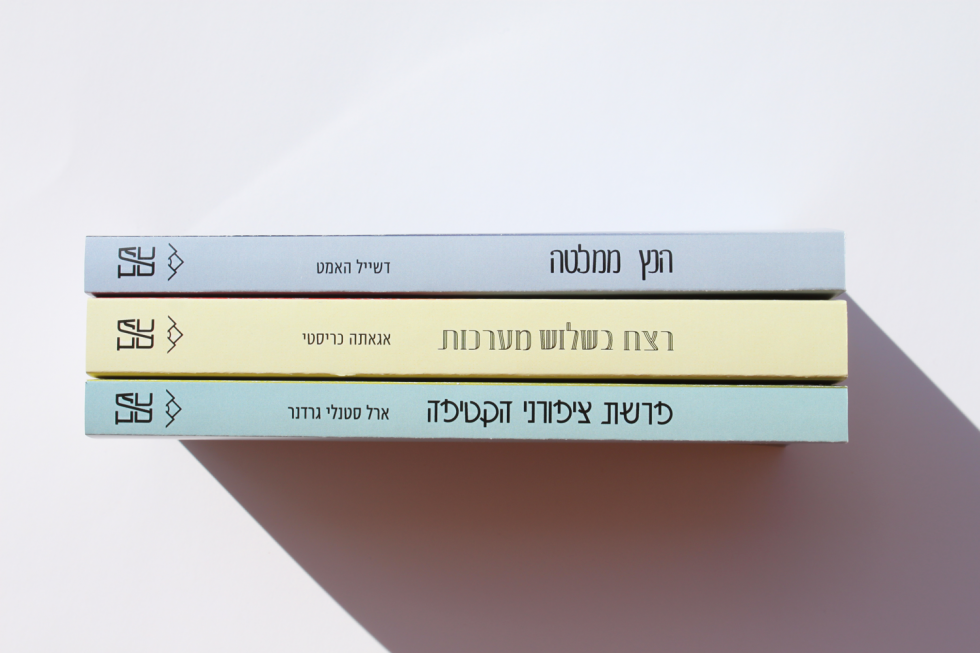
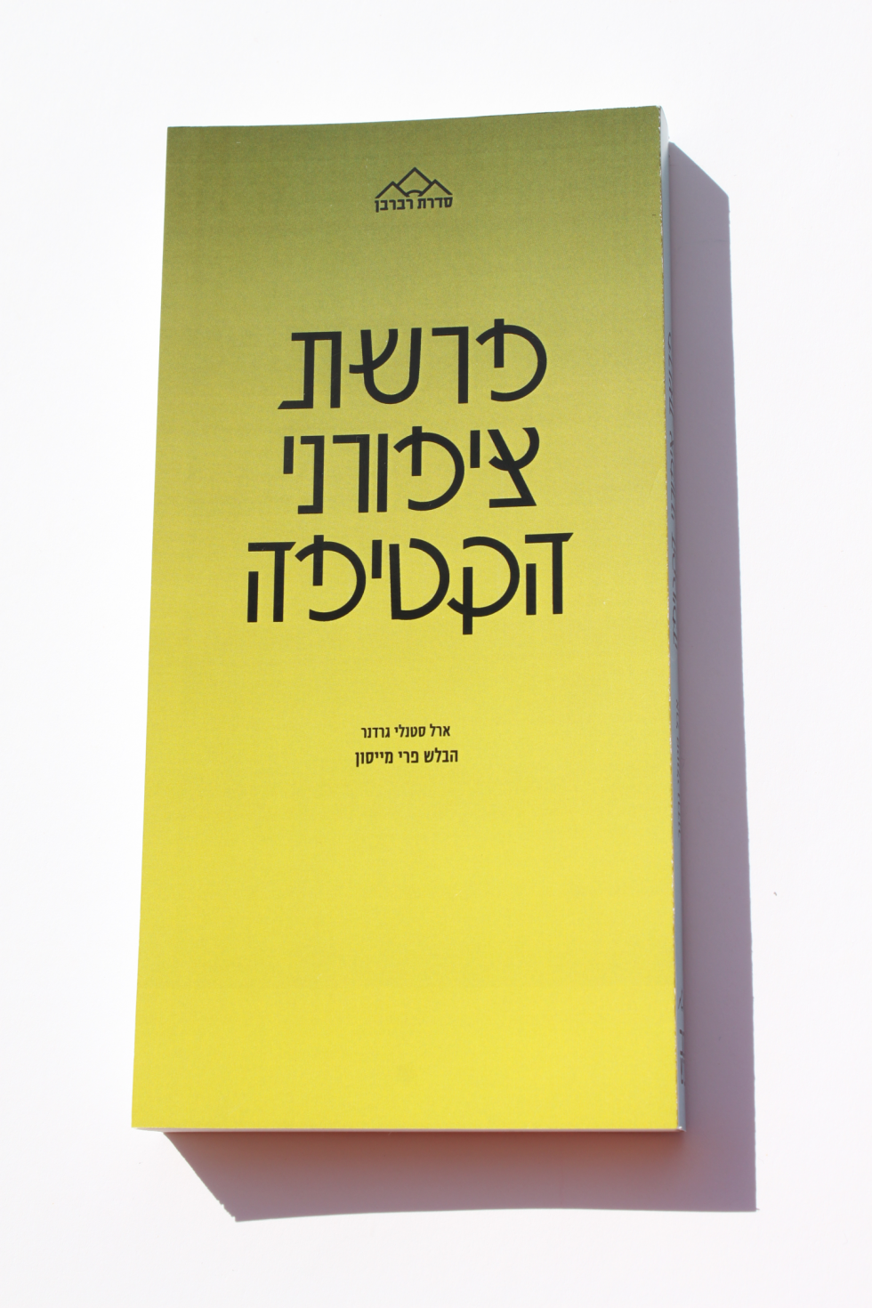
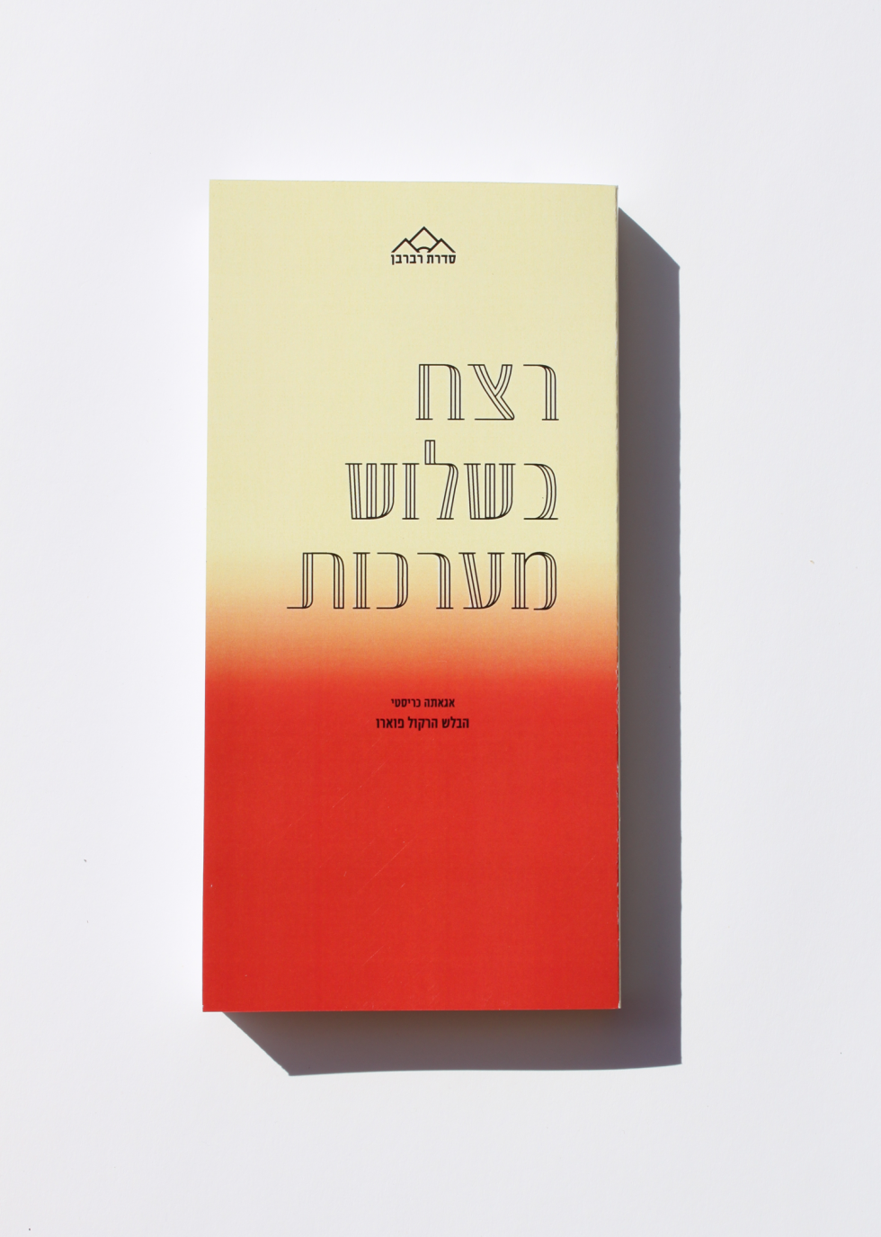
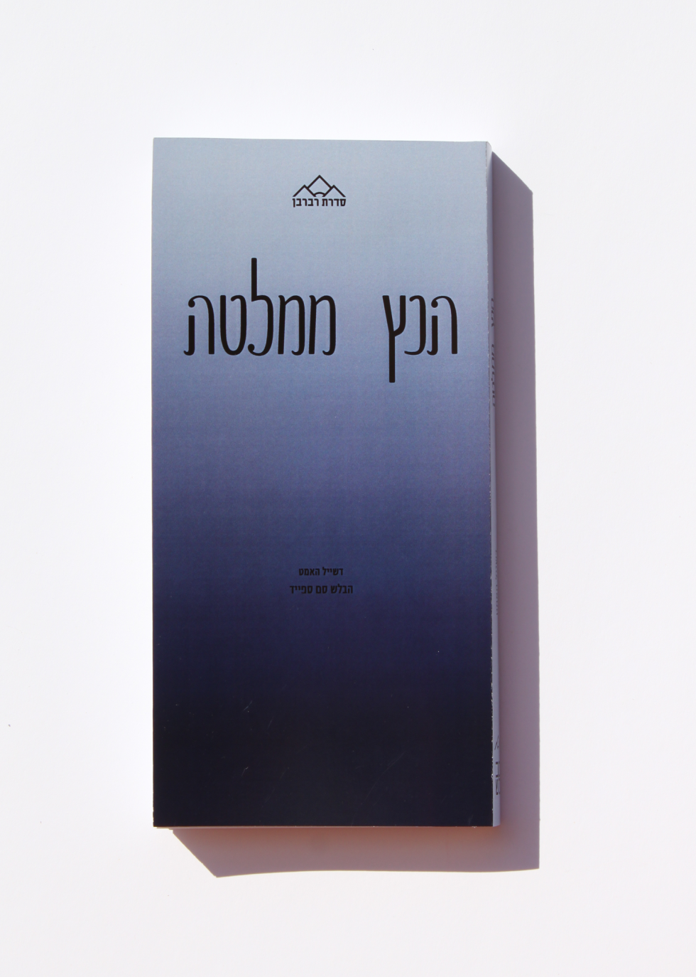
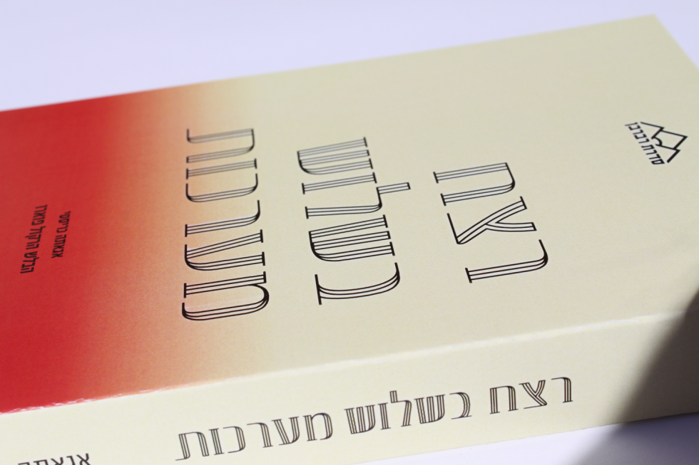
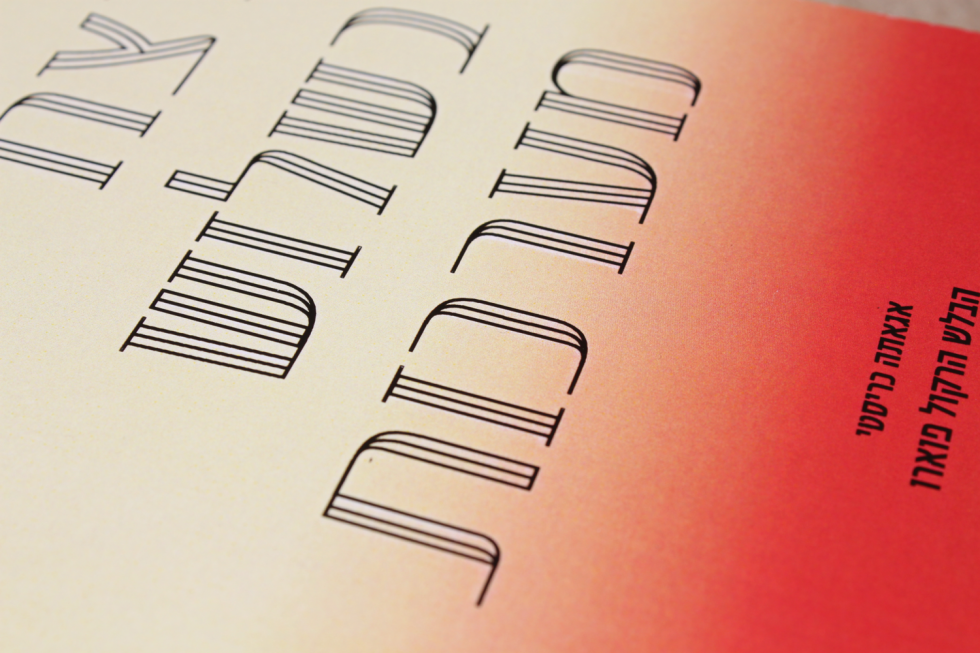
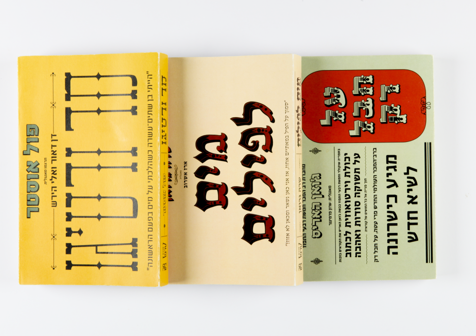
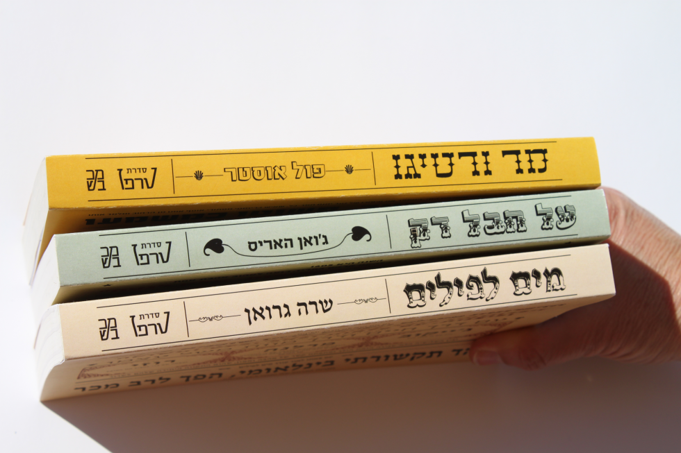
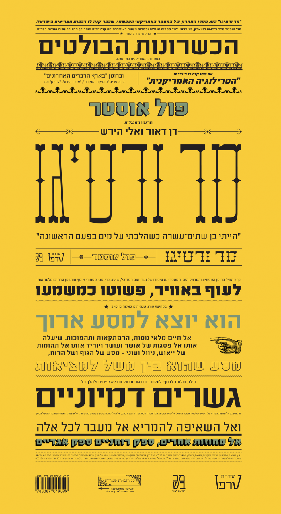
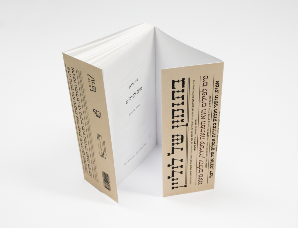
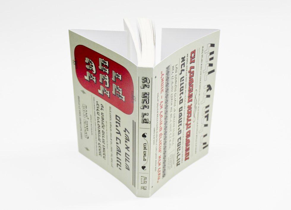
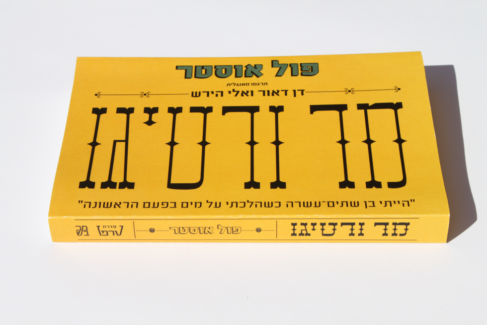
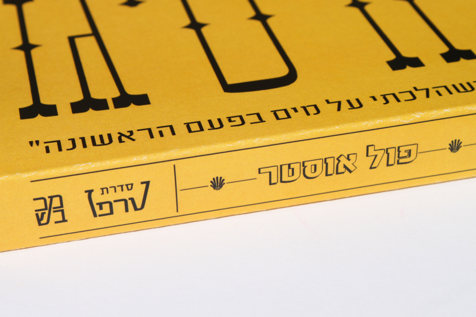
    Typographic book covers for detective novel series. Inspired by art deco, the period in which the novels were written. The lettering is designed especially for the project.


  • CIRCUS BOOK COVERS

    CIRCUS BOOK COVERS

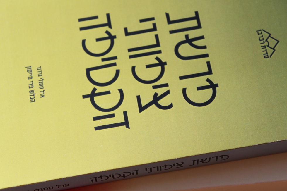
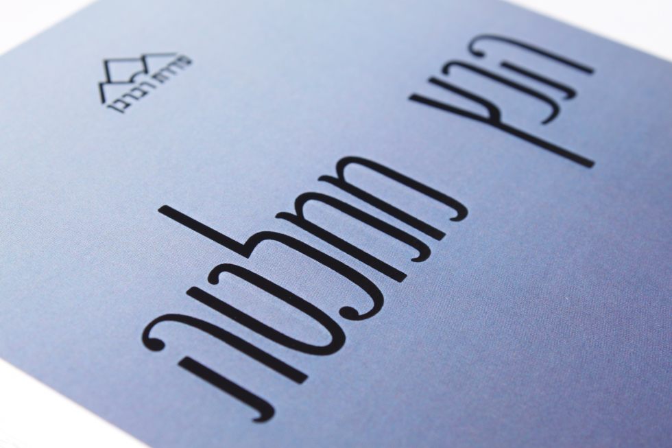
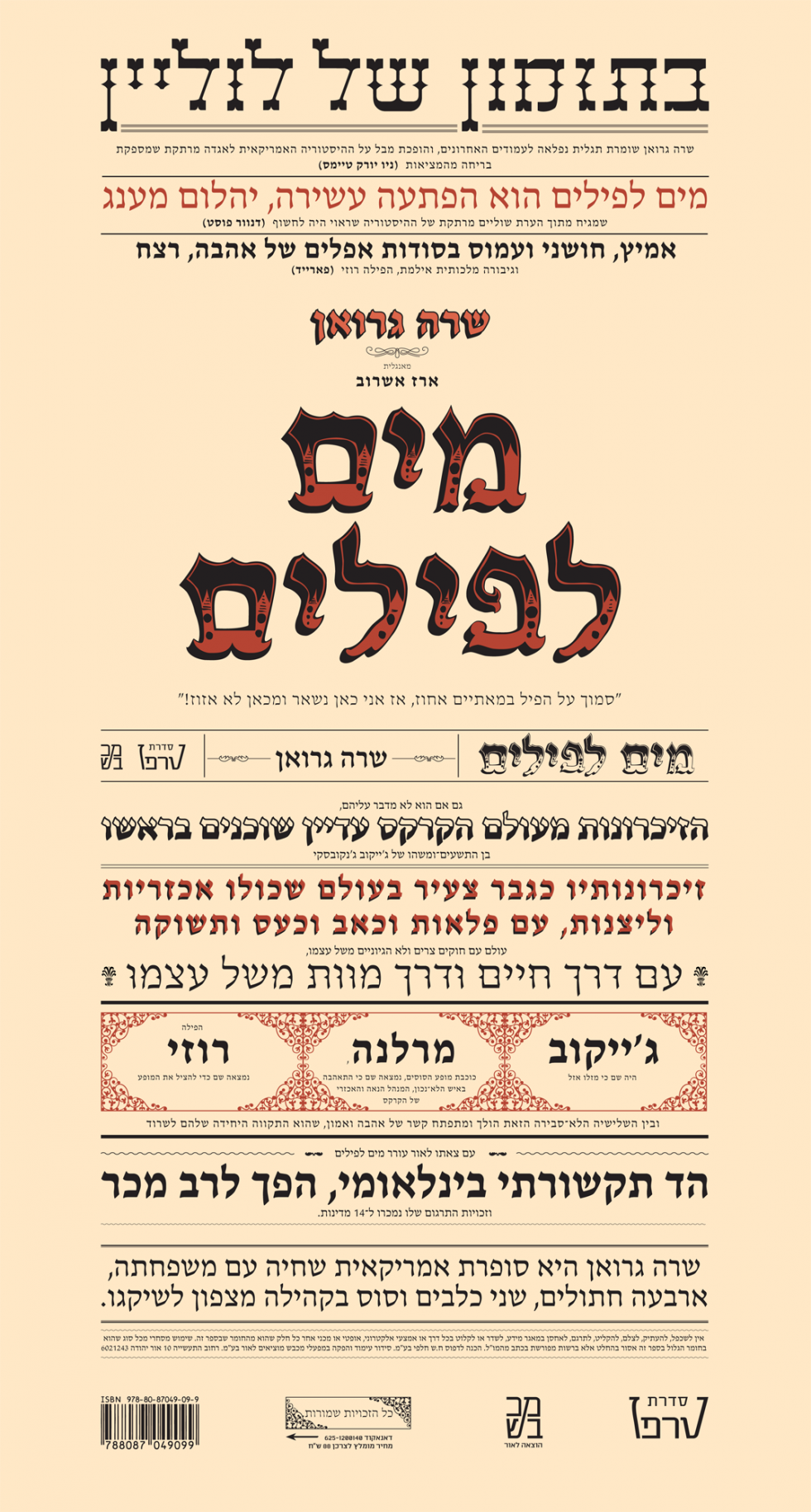
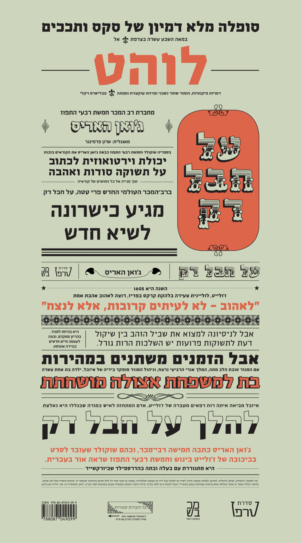
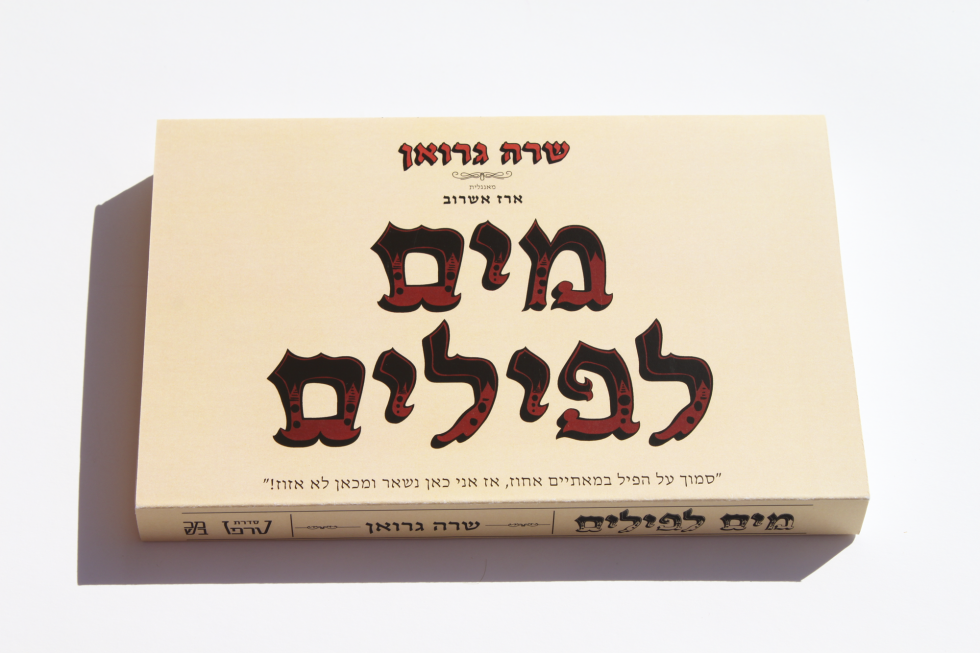
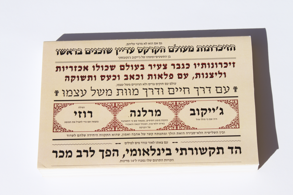
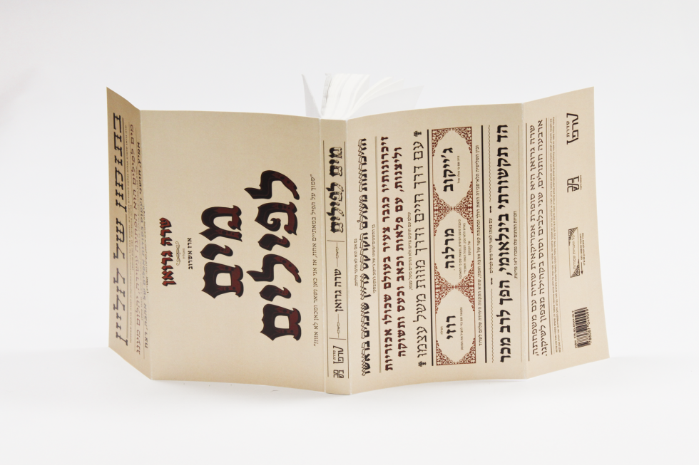
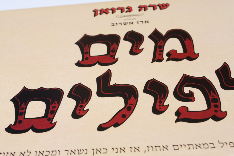
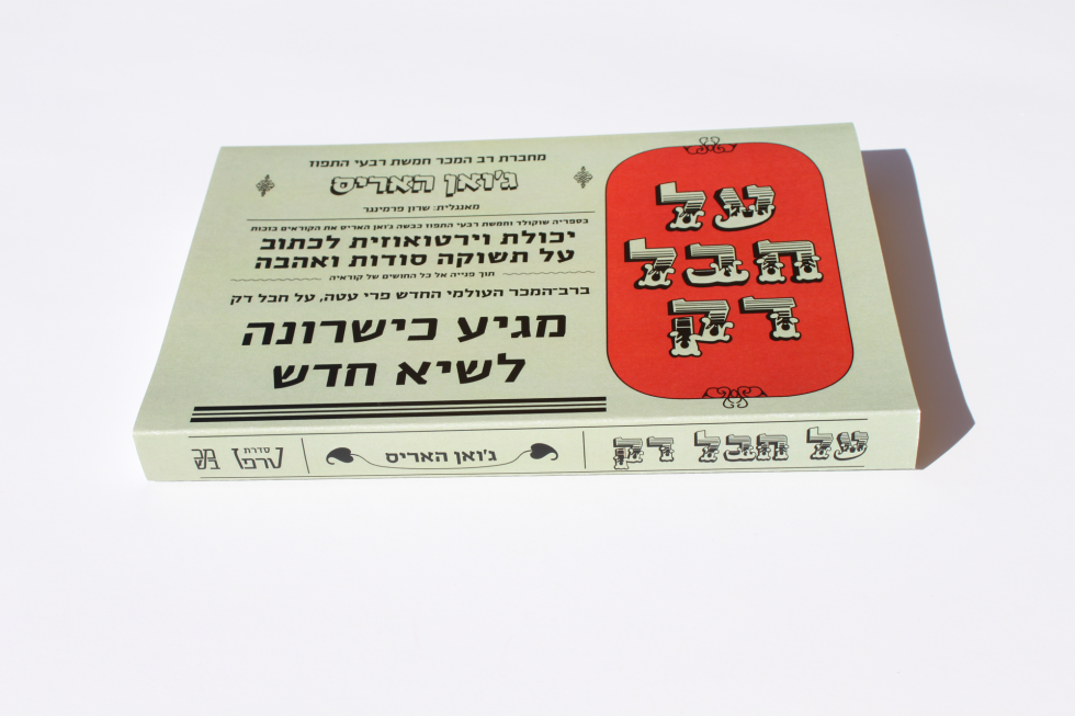
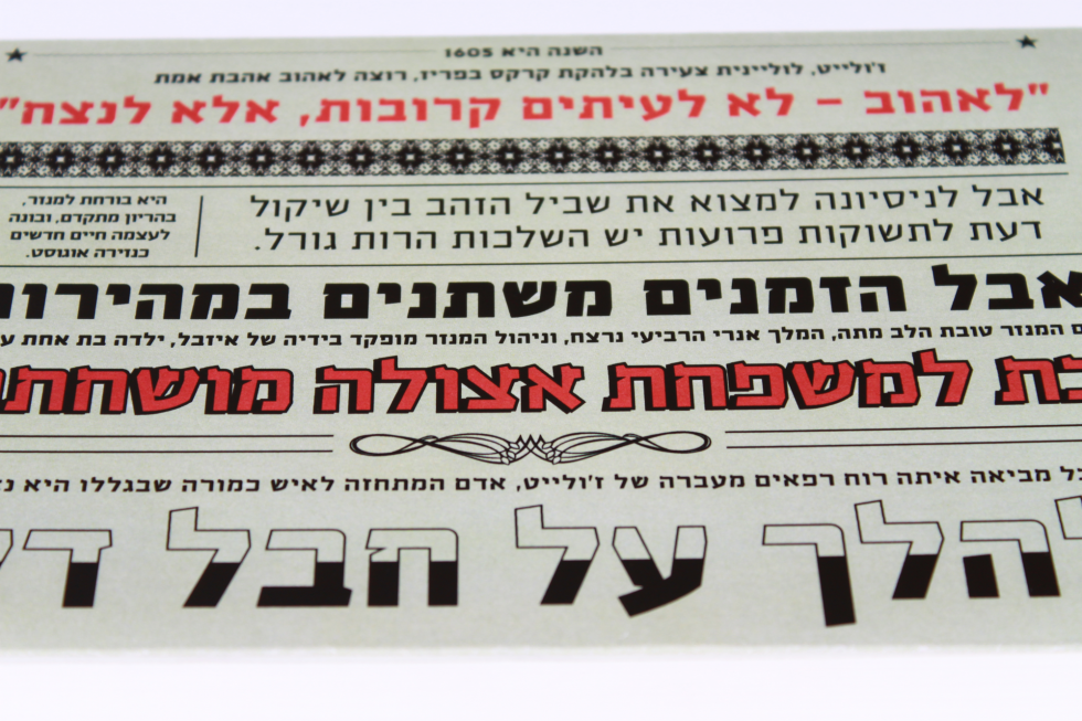
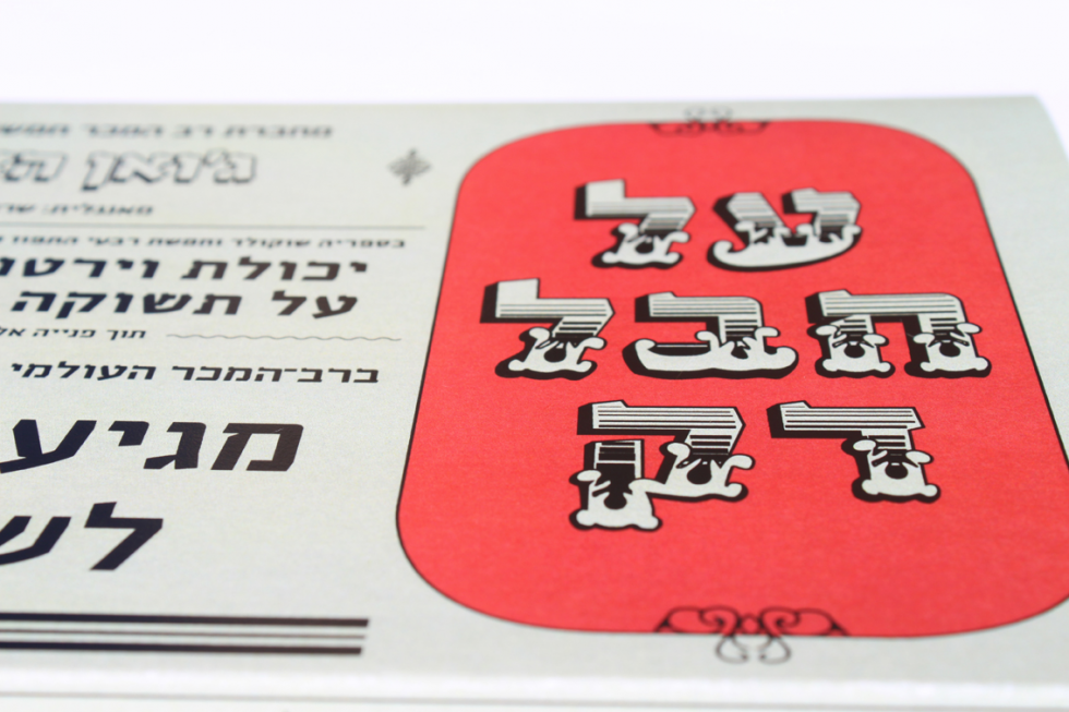
    Typographic book covers. Inspired by Latin wood type. The lettering is designed especially for the project.


  • LEFTY- CALLIGRAPHY FONT

    LEFTY- CALLIGRAPHY FONT

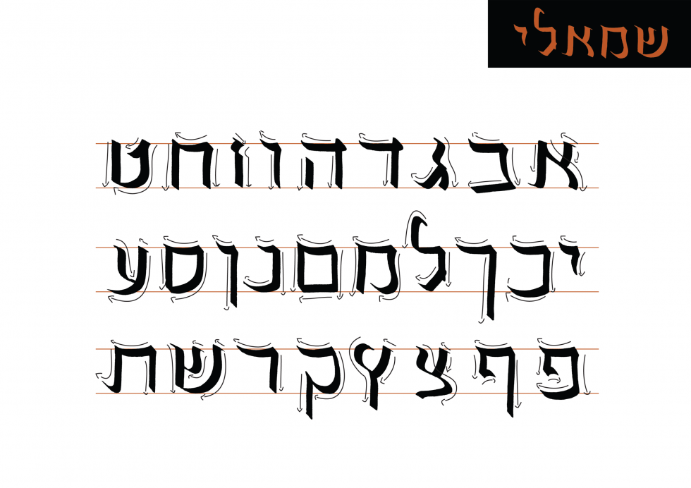
    Calligraphy hand, designed for left handers.

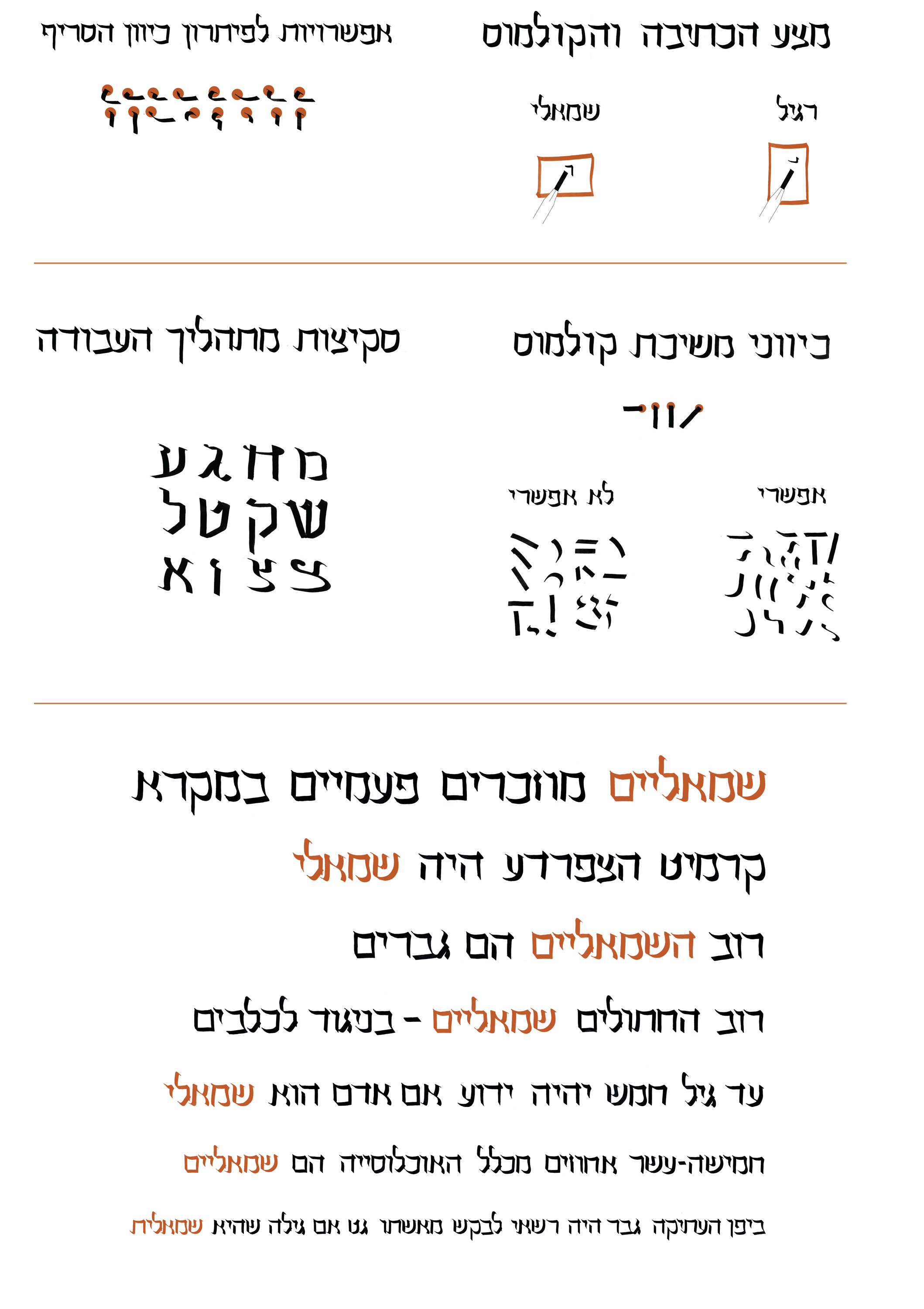
    The direction of writing Hebrew classic calligraphy is designed for right handers. As a lefty, my best option for writing calligraphy is vertically, when the paper is turned in 90°. This calligraphy style, in process of becoming a typeface is based on the nib strokes that are possible and comfortable for left handers. However, by attempting to write it, right handers will have to write vertically, the way us lefties usually do Hebrew calligraphy.

    כתב שמאלי, מעוצב עבור שמאליים.

    כיוון כתיבת הקליגרפיה בעברית מותאם לימניים. כשמאלית, הדרך הטובה ביותר שלי לכתוב היא במאונך, כאשר מצע הכתיבה מסובב ב90°. כתב ‘שמאלי’ מעוצב על בסיס משיכות הקולמוס האפשריות ונוחות עבוד שמאלים. עם זאת, ימניים יאלצו לכתוב בכתב זה בכיוון מאונך, כפי ששמאליים צריכים לכתוב בדרך כלל
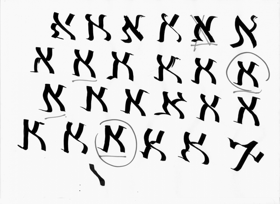
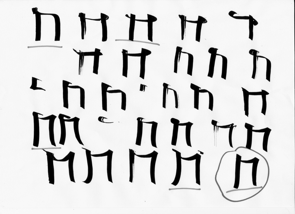
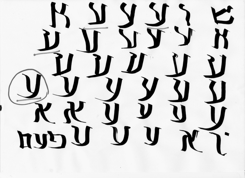
    Here, possible and impossible nib stokes, sketches from the process, options for serifs. The text is set in ‘Lefty’ font